Next to establishing yourself as a consultant, advisor or a coach, comes how to reach the larger audience and make a difference in your and others’ lives, and of course, how to convert your offering and gift of coaching into money.
Getting a professional coaching website for your business is the answer to this question of reaching your prospects. Whether you’re a qualified health coach, life coach, social media coach, SEO expert or a financial planner; your business website is one place where your audience will get to know all about you, how you can help them, how you’re different from others, and even your story – without any obligation to do business with you.
Best coaching websites are simple and powerful enough to make their prospective clients instantly feel that they have reached the right place.
Business comes later. First, let the impact happen with your website.
We will talk about six factors that contribute to making of the best coaching websites for coaches and consultants of all industries – a website that converts visitors into prospects and brings leads.
Yes, such money making websites for coaches are built differently.
The goals of a great coaching and consulting website are;
.. Leave a lasting and strong impression on your prospective clients from the moment they land on your site.
.. Reflect originality, authenticity and world-class authority with impressive media and visuals
.. Keep a soothing stay and navigation with minimal design
.. Make it work with a clear call to action throughout the website pages
.. Ensure that it is optimized well to get found in search engines
So here are the most important elements one must have a professional coaching website that works;
1. Your Bio/About Page
A compelling page “About YOU” for a coaching website is more important than you think. This is where you tell your prospective clients what you do and how. Most importantly, how you make a difference that others’ can’t.
80% of my business leads and speaking invitations come from my bio page contact form.
Create a structure considering what all your audience would like to know to choose you. You can include your story, your professional achievements, your goals and even your clients’ success stories. A sneak peek into your personal life with pictures will add life to your about page.
Personalize your about page by sharing images of workshops or seminars you may have delivered or attended. Understand that people always love to see things in action. Give them what they need.
A bio page in a coaching website can be as rich as possible. Just keep it short and sweet with no more than 2 minutes read.
Close it with an invitation to connect on social media networks where you can engage with prospective clients and let them see you over time.
Consider Reading – How to write a great about me page with examples
Few more recommended reads – How to write a magnetic bio, 4 Rules of great Bio, Killer blog author bio, 5 Minutes to a better bio
Question: I am a new entrant in the coaching and consulting industry. How can I make my bio look impressive and authentic?
Answer:
When writing a blog bio, nothing is more authentic & impressive than honesty. Share your vision, goals and current projects you’re working upon. They might be ad-hoc or pro Bono.
2. Rich Page of Reviews & Testimonials
What’s more convincing than reviews coming from people who have used your services.
Use these great testimonials as proof of your success stories and happy business relationships on your coaching website. No matter what profession you’re in, reviews and testimonials will not only just complement your professional expertise but also reflect your art of maintaining great professional relationships.
Having over 50+ testimonials and reviews on my testimonials page on my website improves my conversion rate and answers a lot of doubts my prospects may have.
Let your new visitors and prospects see how you make your business partnerships profitable, fun, engaging and thrilling at the same time.
They are more likely to take you as an authority when they read others praising the way you make things simple. So, give them what they want to read to feel safe, secure, and confident about your service – give them an enticing page of testimonials.
Love the way Freeagent has displayed their reviews and testimonials. You can also have a look at my testimonials page.
3. Introduction Video
Having an introduction video isn’t necessary on your coaching website but can add a lot of value and confidence to your site visitors. It works well especially for those who are either too busy to read or prefer video or audio. Use a one to three minutes duration video to tell users what they should expect from your service and how they can connect with you.
A video is a perfect way for visitors to see more of your authenticity because body language, expressions and the tone of your voice speaks louder than text.
For example, adding video introduction to my primary coaching service pages has improved the conversion by over 85%.
If you can make them believe that you can share strategies that help them make a better use of their time, they will be in.
Recommended reads on how to create a great introduction video for your coaching website
Great first impression with introduction video, Stand out with a video introduction
4. Add an Active Blog
There is nothing better than a blog to keep sharing useful information and helpful resources with your audience on your business coaching website. Look at your available time and keep a regular blogging schedule. You don’t have to blog every day. You just need to blog consistently, even if it is as less as twice a month. It will take your web presence far – real far.
Business made me rich but blogging made me resourceful.
Readers Choice: How to start with Business blogging
5. Clear Call-to-Action On All Pages
Your coaching business website is the gateway to an action – That’s why you created one at the first place.
You may want your visitors to provide you with more information, their feedback, insights, share their challenges, and ask questions etc.
You can get absolutely everything you want with;
… A strong call to action prompt
… The right navigation & direction to see the call to action
… A good follow up
Whether it is a free download, subscription sign up, an appointment, a contact form, or a phone call, it is important to place them in a highly visible part of your website to make it work.
What is equally important is to ensure visual appearance, simplicity, and relevancy with elements such as snazzy button shapes, large text, first person speech, button graphics, and sense of urgency, make calls-to-action more effective.
Best coaching websites have some of the most irresistible call to action. Make it happen.
See how I receive leads from my call to action subscription which gives away the Linkedin Marketing Checklist.


6. Free Resources
Free resources always help grab visitors’ attention on a coaching website. Before it leads you to a thought that why you should work hard to create such great resources for free, allow me to answer.
First, you don’t have to offer everything thing for free. Rather, create one short but extremely useful resource such as a short ebook or report once in a month or two. This can be the representing resource of the bigger benefits when someone decides to take a paid working relationship with you.
Second, it helps you build a list of contacts who liked your work and may want to hear more from you in future. You can utilize (not spam) this list for sharing regular value and even promote your services.
My resources section brings me 25-50 new email subscribers every day.
Few things to consider when you create such give away and resources for your website.
1. Create lesser resources but make sure of a great promotion so that they reach a maximum audience. Use social media, email marketing, your friend’s networks and every possible thing to distribute your free resources. More visibility is more conversion.
2. Create Timeless Resources – Things that can be used for long term or forever will prove as a better lead magnets and resources. For example, How to Make the Most from Attending World’s Best Conferences is a better subject than How to get maximum leads from XYZ health conference in 2016
Think of timeless subjects so your time and effort are worth spent in blogging.
3. Proofread! Make sure of hiring an editor to get your work proofread and edited before it out to download
3. Publish with amazing contrast, color, and space to lead users to your free resources. You can make them download an app by having a button on your homepage that takes them straight to the order form. You can also offer giveaways and share free resources such as free ebooks if they agree to share their emails – Create an awesome looking and clean sign-up form. There are several good opt-in tools and software available these days. Opt-in Monster is one of them.
For coaches or solo entrepreneurs, the emphasis is always on personal branding first. Interestingly enough, it can help you create an equally powerful business brand by telling your unique story in your own voice.
Your website should do exactly that.
Question; Is a coaching website different from a blog?
Answer: Great question. For independent entrepreneurs, a blog works as good as a website. It is interactive, leads visitors to the desired static pages such as bio and services section, and let them keep coming to read your blog posts. Why would you prefer a boring business brochure site with a few pages when a blog looks lively. For example, my blog is a website cum blog.
Question: Should CEO or a manager of a company have a website?
Answer: What stops you from thinking of the next level and be a thought leader. Your blog or website will be one foundation stone in that process – earlier than others. It acts as the key in building your personal brand more powerful.
Remember, many things determine how impressive your website looks including your own professional expertise and practical experience. Among few most important things, make sure you take care of these 5 when building or re-designing your website.
- Do your homework to gather every possible information
- Hire a strategist to plan a great website for you with the help of your homework
- Get hold of a good website developer to follow the plan and strategy
- Hire an editor or a copywriter to make sure the content is compelling and flawless
- Keep reviewing the performance of your website with analytics
Useful Resource: Best WordPress Themes for Coaches & Consultants Websites
Recommendation to Create Best Coaching Websites for Coaches & Consultants
I operate as an advisor and strategist to SERPHOLIC Media that creates outstanding websites for coaches. These websites are planned and designed to bring more leads, prospects and create a powerful personal brand in the industry.
The cost of a website design for coaches and consultants range between $700-1100 depending upon the features and functionalities.
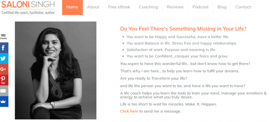
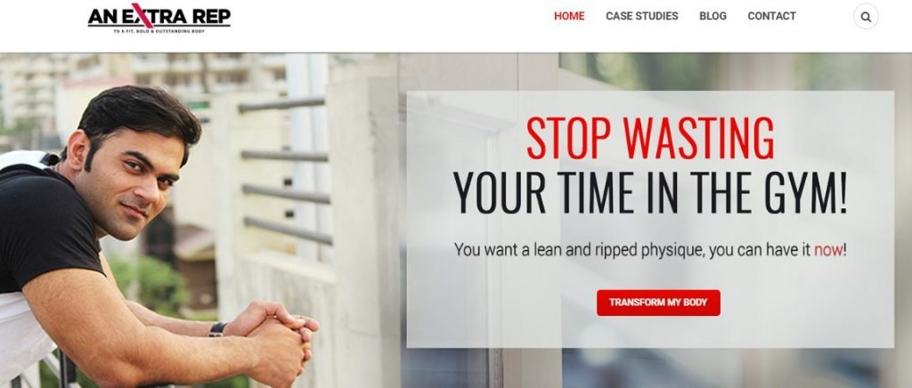
Some of the best coaching websites designed by Serphlic Media for many life coaches, executive coaches, business coaches and consultants are shared below;

Now over to you? Do you have a great coaching business website that follows these must-have factors? Share in comments. If this post was of help, we would love to see your before and after website version. And any question, you’re welcome to ask in comments or email me at hello@sunitabiddu.com

Sunita Biddu is a digital business coach and power blogging mentor helping coaches and small business owners. She helps with building a strong and profitable online presence and reputation that creates a self-sustaining business. Sunita writes on this blog once a week about easy-to-use guides and articles about business, coaching, social media and blogging. You can grab some of her free resources and ebooks from the resources section.


